
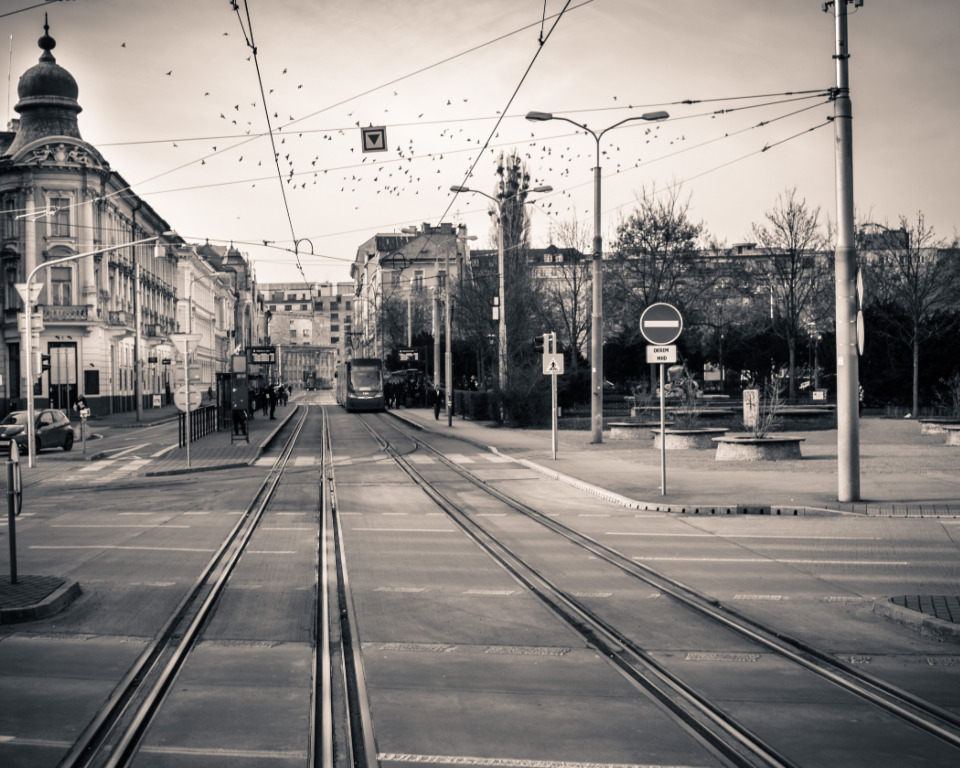
The suspicion I have about my own black and white
I have made a lot of black and white pictures, and I believe in maybe half of them. The other half I converted because the color was not working and gray felt like a rescue. That is a real thing and I want to be honest about it, because I do not think I am alone in it, and because pretending otherwise made me a worse photographer for a couple of years.
Here is the shape of the problem. Black and white removes information. Removing information usually makes a picture look more considered, because the eye reads simplification as intention. So a mediocre frame in color can become an acceptable frame in gray, and acceptable is a dangerous place to live. The picture has not gotten better. It has gotten quieter, and I have mistaken the quiet for depth.
What made me start checking
The thing that broke it open for me was a set from a morning in early spring. I had walked out along the road past the last houses and photographed a field, a fence, and a stand of trees that had just started going green at the tips. In color it was a nothing picture. Muddy field, gray sky, a bit of new green, no real structure anywhere.
I converted it. Suddenly there was a nice tonal separation between the wet earth and the dry grass, the sky went silvery, the fence line had a rhythm to it. It looked, I thought at the time, like a photograph. I printed it small and put it on the shelf by the door and felt pleased for about a week.
Then I walked past the same field again and realized what I had actually been standing in front of. The whole point of that morning, the only reason I had stopped, was that the tips of those trees were going green for the first time in months, and I had made a picture in which that was invisible. I had removed the subject and kept the composition. The gray version was better looking and completely false.
The test I run now
Since then I have used a simple question, and it has saved me from myself repeatedly. Before I convert anything I ask: is the color in this picture carrying meaning, or is it just present?
Sometimes color is only atmosphere. A brown street, a brown building, a brown coat. Nothing is doing any work. Take it away and you lose nothing but a slight sense of season. Fine, convert it.
But sometimes color is the entire fact. The green tips on those trees. A red door on a white house, which is a picture about the red door. A woman in a yellow raincoat crossing a wet parking lot, where the whole reason my head turned was the yellow. Convert those and you have made a picture about shapes, and the shapes were never the reason. If I cannot describe why I stopped without using a color word, I have no business converting.
The test is not perfect. There are frames where the color matters and gray still improves them, because the color was so loud it was drowning something else out. But the test forces me to make a decision instead of drifting into gray by default, and the decision is the whole thing.
Three ways I have used gray as a cop-out
I want to be specific, because vague self-criticism is easy and useless. Looking back through two years of files, my dishonest conversions fall into three groups.
- The rescue. A frame with no clear subject, where mixed and unattractive colors were making the mess obvious. Gray hid the mess.
- The dignity coat. Ordinary domestic pictures — a kitchen, a driveway, somebody on a porch — that I converted to make them feel weightier and more permanent than they were. This is the worst one, because it worked.
- The bad-light patch. Frames made under mixed indoor light where nothing could be balanced and everything looked sickly. Gray solved a technical problem and told the viewer nothing.
The dignity coat is the one I still catch myself reaching for. There is something about gray that says this is a serious photograph about time and memory, and if you point it at a perfectly ordinary Tuesday afternoon it will make claims on your behalf that the picture cannot back up. I have made my own life look more solemn than it is, and when I saw a run of those prints together I found them a little embarrassing.
When it is not a cop-out at all
None of this is an argument against black and white. There are frames I made where gray is not a subtraction, it is the point, and I can usually tell why.
The clearest case is when the picture is about light itself. If what I want you to look at is how the light falls across a wall, or how a shadow cuts a body in half, or the way a bright window turns a room into two flat zones, then color is a passenger. Removing it puts all the attention on the thing the picture is actually about. Those conversions feel like sharpening, not hiding.
The second case is texture. Wet asphalt, peeling paint, the grain of an old fence, hair against a lit background. In color those surfaces compete with hue for attention. In gray they get the whole stage.
The third case is when the color present is genuinely arbitrary. A crowd of people in a dozen unrelated shirt colors, where the color is noise created by chance rather than by anything I saw. Stripping it is not a lie, because there was no truth in it to begin with.
What those three have in common is that gray adds emphasis rather than covering an absence. That is my whole standard now, stated as plainly as I can manage.
Deciding before versus deciding after
There is a version of this argument that says you should commit to gray before you make the picture, that deciding afterward is inherently dishonest, and I do not fully buy it. But I have found that the two ways of working produce different pictures, and it is worth knowing which one you are doing.
When I have decided in advance that a walk is a gray walk, I see differently. I start noticing edges, tonal contrast, where light stops. I skip the red door entirely because I know it will not survive. My hit rate goes up and the pictures have a consistency to them, because I was hunting for what the medium can hold.
When I decide afterward, at a screen, I am not seeing, I am salvaging. Sometimes salvage is legitimate. But it is a different activity and it has a different smell, and the frames that come out of it tend to be the ones I am unsure about a month later.
So I have started doing some deliberate gray walks. Not many. Maybe one in six. It is a useful exercise even for my color work, because a few hours of thinking only about light and edge changes how I look at everything for a while afterward.
Where this leaves me
I keep both. I am not a black and white photographer and I am not a color photographer, I am a person who takes pictures of a small town and tries not to lie about them.
The rule I have written on an index card and stuck near the desk is short: if gray is doing something, use it; if gray is hiding something, fix the picture or throw it out. Most of the time when I am tempted, the honest answer is that the frame was not good enough and no amount of processing was going to change that. Deleting it is faster and I sleep better.
And I went back to that field, three springs running now, and I have a color frame of it that I finally like. The green is small and it is off to the left and you might not see it right away. But it is there, and it is why I stopped, and the picture and my reason for making it are finally the same thing.