
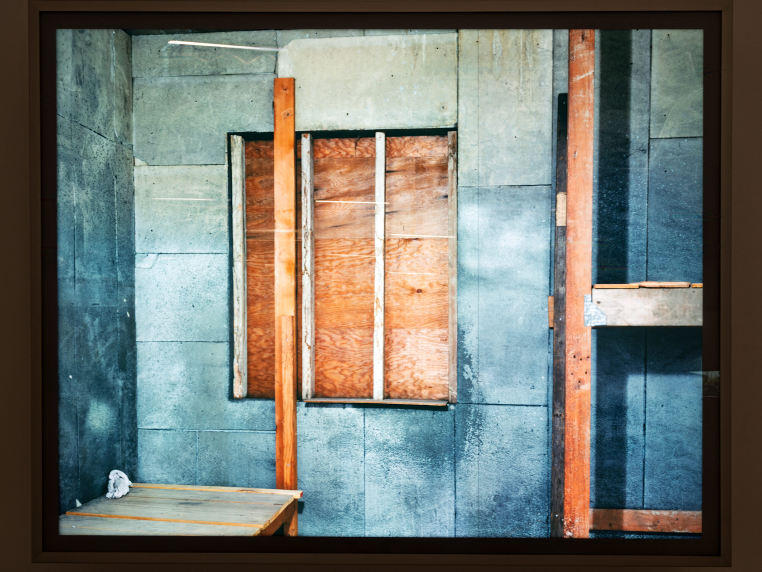
A compelling composition gives the eye a reason to enter the frame, somewhere to travel, and a place to rest. Technical correctness only gets a photograph to the starting line. What holds attention is how the subject, the empty space around it and the lines between them are arranged.
This guide covers the ideas worth knowing, then a practical exercise built around one street corner.
What separates a correct photo from a compelling one?
A correct photograph is sharp, properly exposed and shows what was in front of the camera. A compelling one also tells the viewer where to look first, where to look next, and why the frame is arranged the way it is. Composition is simply the arrangement of elements within the image, and it is the skill that separates ordinary snapshots from photographs that tell a story.
A small town is a useful testing ground because it hands you plain material: a corner, a fence, a lamppost, a shopfront. None of it is dramatic. That is the point. When the subject is ordinary, the only thing left to make the picture work is how you arrange it.
It helps to treat composition as a series of decisions rather than a talent. Each decision, such as where to stand, what to include and what to leave out, either adds tension or removes it. A frame in which nothing was decided usually looks it.
How do visual weight and entry points guide the eye?
Every element in a frame carries visual weight. Bright areas, high contrast, saturated color, sharp texture and anything with a human face pull harder than dark, muted or soft areas. When one heavy element sits alone and nothing answers it, the frame feels lopsided in an uncomfortable way. When several heavy elements compete, the eye bounces without settling.
An entry point is where the eye first lands, and it usually comes from the heaviest element or from a line that points toward it. Lines do much of this work. Leading lines such as roads, pathways, fences or building edges draw the viewer into the image and add depth. In a town street, curbs, fence rails and rooflines are all available.
Check your frame for these questions:
- Where does the eye land first, and is that where you intended?
- Is there a path from that point to a second element?
- Does anything at the edge pull the eye out of the frame?
- Is there somewhere for the eye to rest once it has traveled?
If you cannot answer the first question, the composition is not finished yet.
What is the difference between symmetry and balance?
Symmetry means elements are evenly distributed on both sides of the frame. It feels stable and orderly, and it suits patterns, façades and anything built to be even. The cost is that it can sit still. A square frame in particular is stable by nature and has little built-in movement, so it needs a subject that justifies that stillness.
Balance is a different idea. An asymmetrical composition can also feel balanced when elements of different visual weight sit on opposite sides of the frame. A small, bright object can offset a large, dark one, much as a light person sitting far from the pivot balances a heavy person sitting close to it on a seesaw. The result is usually more dynamic than strict symmetry, because the eye is drawn back and forth across the image.
The practical lesson: do not confuse placing things evenly with achieving balance. Ask whether the weight on each side of the frame answers the other, not whether the two halves match.
How does negative space anchor a subject?
Negative space is the area around and between the things you are photographing. It is not wasted frame. It is what gives the subject room to register. A common guideline holds that placing the subject dead center often gives a static, uninteresting result, which is why the rule of thirds exists: divide the frame into a three-by-three grid and place key elements along the lines or at their intersections.
Treat that as a starting point, not a law. The deeper principle is that the relationship between subject and empty space creates tension. A lone lamppost placed off-center, with open sky or a blank wall on one side, reads as deliberate. The same lamppost in the middle of a crowded frame reads as an obstruction.
A gap in a fence line works in a similar way. It creates a frame within the frame, pointing the eye toward whatever sits beyond it. Natural openings such as archways, windows and gaps can enclose a subject and add depth. Use them when they reinforce the subject, and skip them when they only add clutter.
Also watch for the opposite problem. Try to arrange elements so that no part of the photo feels crowded while another feels empty. If you could remove a section of the frame and the picture would improve, the frame was composed too loosely.
How do you practice with the same street corner ten times?
The exercise is simple and slightly tedious, which is why it works. Pick one corner in town and stay with it. Shoot it ten times, changing one compositional decision each time. Do not move on until each version is a genuine attempt, not a copy of the last one.
A workable sequence:
- Shoot it straight on, subject centered, as a baseline.
- Move the subject to a third line and leave open space on the other side.
- Crouch low so lines in the pavement or curb lead into the frame.
- Step back and find a natural frame, such as a doorway or a gap between objects.
- Switch between horizontal and vertical orientation.
- Tighten the crop until only the essentials remain.
- Pull wide and let negative space dominate.
- Wait for a person, car or shadow to enter and change the weight of the frame.
- Look for a diagonal and tilt your position to emphasize it.
- Choose the version you expect to fail and shoot it anyway.
As a general rule, choose a horizontal frame when most of the lines are horizontal and a vertical one when they run up and down. Occasionally doing the opposite adds tension, as long as you leave breathing room around the subject.
Review all ten together. The differences will teach more than any list of rules, because you see which single change made the frame work.
Why is strong composition so often recognized only in editing?
Mostly because capture is fast and judgment is slow. A painter can spend weeks refining a composition and verify each step. A photographer working with a street, a market or changing light often has very little time to decide, sometimes a split second. You make instinctive choices at the scene, and your critical eye catches up later, at a desk, with the pictures side by side.
That has two practical consequences. First, take an extra frame or two, in case the first one missed something. Second, expect the best composition to be a surprise. A frame you barely registered at capture may turn out to hold the strongest arrangement, while the one you were sure about may feel flat once you see it at full size.
Editing also gives you a second chance to fix things. Cropping removes distracting elements, improves balance and changes the aspect ratio, and it helps pull the viewer’s attention onto the subject. Use it to refine a good frame, not to rescue a frame that never had a decision behind it.
The honest conclusion is that composition improves mainly through repetition and review. The exercise above is useful partly because it forces both: you shoot with intent, then you look with patience.
Frequently asked questions
Is the rule of thirds always the best choice?
No. It is a guideline for avoiding a static, centered subject, and it works well across landscapes, portraits and still life. Some subjects, such as patterns or symmetrical architecture, suit a centered, stable arrangement.
Should I crop in editing or compose it right in the camera?
Do both. Compose as carefully as the moment allows, then use cropping to remove distractions and tighten balance. Cropping refines a strong frame, but it cannot supply decisions that were never made at capture.
What makes a square frame difficult?
A square frame is naturally stable and has little movement of its own. It works best with a subject that is stable too, such as a pattern or something symmetrical, so you need a clear reason to choose it.
How many frames should I take of one scene?
More than one. Because photographers often have little time to decide, an extra shot or two protects you against missing some aspect of the first one. The ten-frame street corner exercise is a deliberate version of this habit.
Related reading
- The Day Photography Got Me Unlost in the Streets of Lisbon
- Farmers market photography: light, movement and faces
Sources
- Mastering the Art of Photography Composition (swiftgalleries.com, accessed 2026-11-09)
- Photography Composition: The Definitive Guide (antongorlin.com, accessed 2026-11-09)
- What is Composition in Photography: Essential Tips (proedu.com, accessed 2026-11-09)
Photo: Framed Composition Abstract Architectural Study at MAAT Lisbon (54706407779), by Dale Cruse – 10M views from San Francisco, CA, USA, CC BY 4.0 (Wikimedia, via Openverse)